Auto Accessories
Real projectGTLora
A stripped-down, minimalist storefront built around one idea: fewer products, each one actually solving a problem.
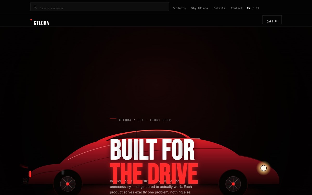
The Project
GTLora sells a small, focused range of auto accessories, and wanted a site that reflected that focus instead of trying to look like a big-box catalog it isn't.
The Challenge
Many accessory stores try to look larger than they are by padding out the catalog and the page itself. GTLora's product range is intentionally small and considered, and the site needed to make that feel like a strength — a curated selection — rather than a limitation.
The Approach
The design strips away anything that isn't the product: a bold, dark, minimalist layout that gives each item room to be seen clearly, with no filler categories or decorative clutter competing for attention.
- Minimalist, bold layout built around a focused product range
- No filler categories — every product gets real visual space
- Dark, confident visual identity matching the automotive audience
- Fast-loading, mobile-first build for on-the-go shopping
The Result
The site is live today. It was designed to make a small, focused catalog feel intentional and premium, rather than making the store look bigger than it is.
Need something like this for your business?
Let's talk about what a project like this would take.